
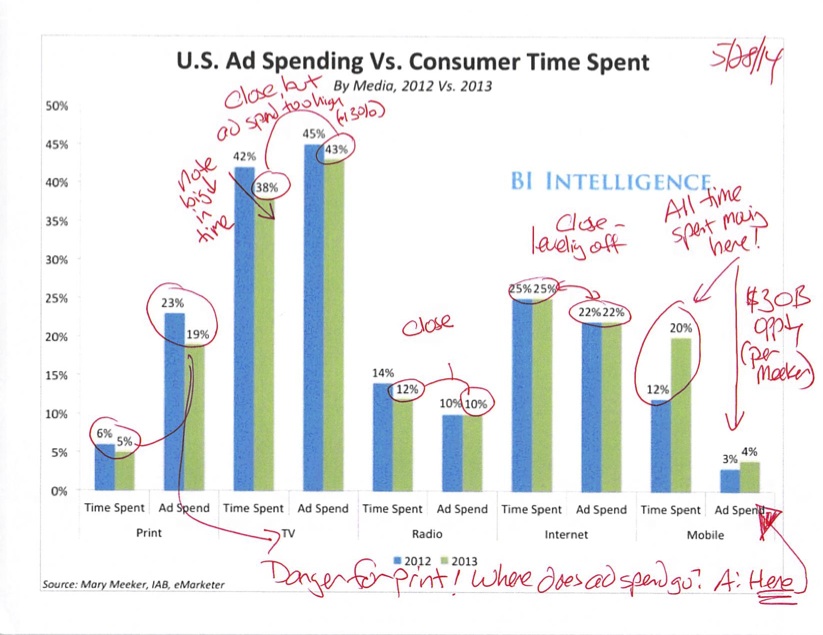
US Ad Spending vs. Consumer Time Spent, 2012 vs 2013
This graphic from BI Intelligence showed up in my email yesterday and I took the time to scribble all over it. (I tend to think with a pen in hand.) I found it relevant to my recent post about the New York Times Innovation internal report.
The problem for the New York Times lies in the two leftmost sets of bars. Notice how time spent with print is down to 5% of our media consumption time in the United States, yet 19% of advertising spending is still directed to print?
The bars will never always align completely, as people are always shifting media habits to new channels and new forms of entertainment. But what I’m certain will happen is that the advertising dollars will shift to mobile. Per Mary Meeker’s recent Internet Trends deck (a must-read), that means about $30 billion in advertising spend should start flowing to mobile.
The chart demonstrates that most channels are reasonably aligned in time spent vs advertising dollars. So it’s clear that the dollars will flow largely from print to mobile. That’s what’s out of whack. Yes, you can argue that the time spent with print is of higher quality than looking at cat videos on your mobile device. But even if print time is double in value, then 10 percentage points of advertising still has to flow somewhere.
And, this graph only shows 2012 and 2013. The time spent in print certainly isn’t going up and to the right.
What should the Times do about this? Well my thoughts are here. Importantly, there should be a rabid focus on mobile. Because that’s where all the money in print advertising is going.


You must be logged in to post a comment.